Dec 15, 2009
Mockup for short links on Twitter
And now for something a little different: most if not all of my posts here have been code-related even though a big part of my work and interests are design-related, something with which you might be familiar if we’re friends on twitter
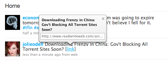
Recently Chris Messina offered a suggestion on how Twitter could better integrate short links.
This prompted me to summarize my thoughts on the problem they introduce in the UX. The Twitter Fan wiki page on short links explains those technical and design problems, and lists current practices and alternative solutions, including the one I’ll present here today. Even though I’ll offer several different ideas, they’re sequential in my mind. I see them as different versions of a solution, as part of the design process, rather than different solutions.
For reference, this is how Twitter displays links at the moment.

The most obvious thing to do is integrate expansion on demand as exists on the Twitter search (ex-Summize) page. The version A is exactly that.

The version B is a modification I made to make the expansion process secondary (and it’s the one I use at the moment in our own unreleased client, but this will change).

The expand buttons (possibly underlined) would be slightly transparent in order to blend in better but would have full opacity on mouse hover.
However those 2 versions only show the information you’re looking for when you interact with the expand buttons. This interaction is pure excise.
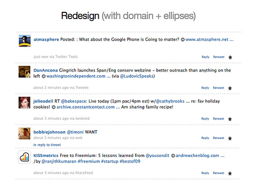
So, the next version, “With Host”, adds feedforward on the short link by showing the host/domain it points to. It’s only slightly better, but offers reassurance if the site is one you trust and visit frequently.
However, in my mind short links are a hindrance to the experience and shouldn’t be a focal point in the tweet — the real links are actually more important in the message. The next version, “Inverting the polarity”, keeps the feedforward of the previous version, but shows more info and puts the expanded link in the tweet itself. The short link being relegated to the sideline here.

I strongly think the expanded URL shouldn’t be shown fully here, the links people shorten are often huge; they would offer little added value (what can you tell from a 150-character link you couldn’t from a 100-character one), they’d mess up the layout, etc. So only the first X characters would be shown, say 20 or so as I used here, and an ellipsis if the whole URL was cut off.
Continuing in that direction, the last version “Bye-bye short link” removes the obscure short link from the main content altogether.
In those last 2 versions, you could add an expand button (I originally designed the ellipsis to be this expand button but I feel it’d be a hard-to-hit target—even with more space between the link and the ellipsis, which is not shown here—but I don’t think we’d need one, for a simple reason. There already exists an interaction for knowing where a link points to: put the mouse cursor over it, and look in the browser’s status bar. Of course, just adding this to the other versions (including the one Twitter uses) would shed some light on the short link black hole, even though hijacking the status text like this has to take accessibility into consideration.
Of course, a tooltip window similar to Chris’ could be another direction, however I feel that just using “link” could be seen as giving even less information than the already obscure short link.
It could go really well with the ‘Bye-bye short link’ design, where the tooltip window would show the original short link url (and who knows maybe also some stats, even though I suppose they’re probably only used by a tiny fraction of people)
I don’t feel the URL expansion being slow is a problem, provided it’s done *before* showing the tweet in the timeline. Be it on the twitter.com website or in a client, I believe users have no easy way to tell they received a tweet 30 seconds later than they were “supposed to” (this could be the maximum timeout allowed for the URL expansion to succeed). If the link wasn’t already expanded in the tweet (last 2 versions), the Summize style expansion would here be immediate.
Even though my personal opinion has no value compared to user testing, removing the short link altogether is my favorite :) These different versions all evolved into removing it, and this last version represents my current thoughts on the problem.
Shortly after I tweeted this, Chris came up with another redesign blending several ideas. I’m happy with the direction and feel we’re getting somewhere interesting.
I’d love to get some feedback, tweet about this using the #shortlink hashtag. You can find me at twitter.com/lqd


